Client

Nestlé Nespresso

Project Type

Navigation & information architecture

Role

Global Product Design Lead

Team

Product, Design, Engineering, UXR, Markets

Timeline

2024 - 2025

Rebuilding navigation around how customers think — 3.5× first-attempt task success, across 40+ markets.

Overview

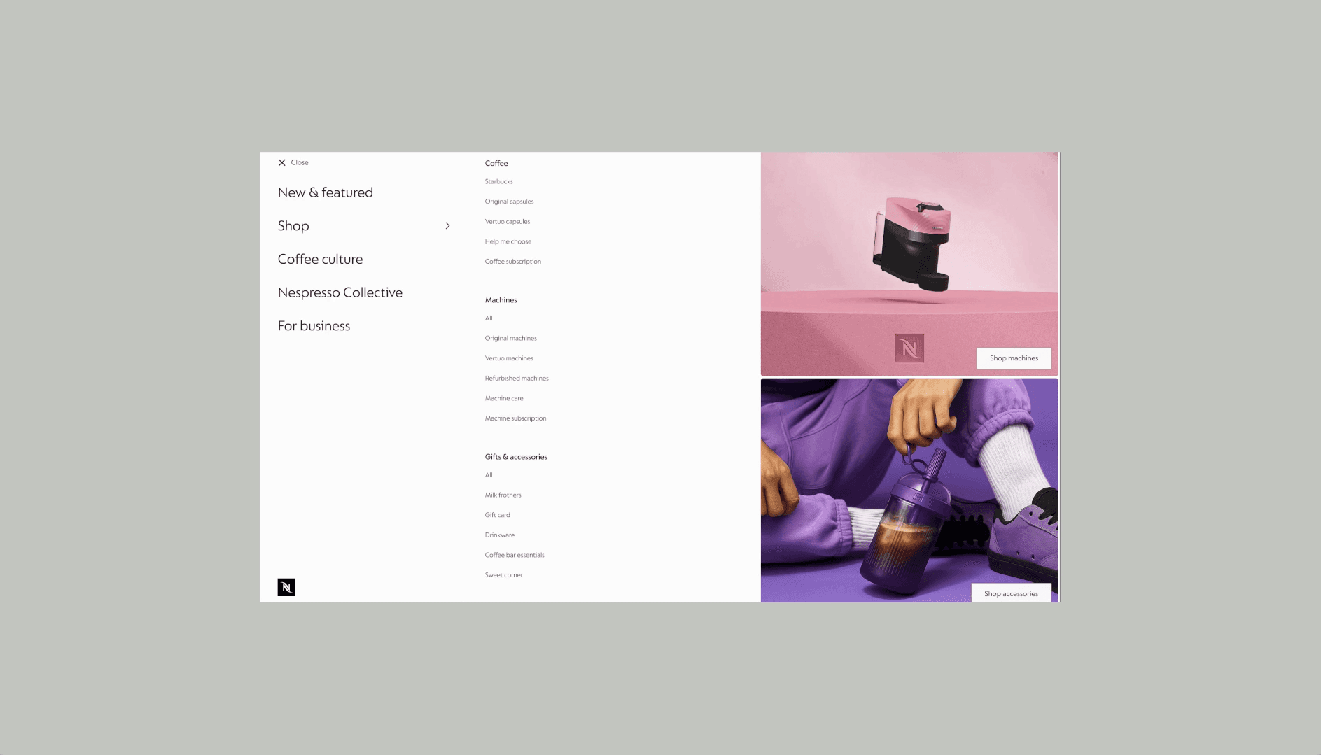
Nespresso’s navigation had grown category by category until it reflected internal structure more than customer expectation — eleven flat items on mobile, no hierarchy, shopping sitting beside order tracking. Meanwhile the business was widening: new coffee formats, partner brands, and a push to make the site somewhere people spend time rather than restock.

A menu tidy-up became a bigger question: how might we build a navigation model customers understand, while supporting different products and commercial needs across 40+ markets?

Scope

Mobile and desktop mega-nav, taxonomy, naming, and the governance model markets work within.

My role

Led navigation and IA strategy end to end, hands-on across research design, card sorting, tree testing, prototyping and validation — with Product, UXR, Content, Engineering and market teams.

Impact at a glance

0%

entered the correct section

0%

first-attempt success, vs 20%

0+

markets aligned

0

Web blocks

0

11 to 5 top-level menu items

Client

Nestlé Nespresso

Project Type

Navigation & information architecture

Role

Global Product Design Lead

Team

Product, Design, Engineering, UXR, Markets

Timeline

2024 - 2025

Rebuilding navigation around how customers think — 3.5× first-attempt task success, across 40+ markets.

Overview

Nespresso’s navigation had grown category by category until it reflected internal structure more than customer expectation — eleven flat items on mobile, no hierarchy, shopping sitting beside order tracking. Meanwhile the business was widening: new coffee formats, partner brands, and a push to make the site somewhere people spend time rather than restock.

A menu tidy-up became a bigger question: how might we build a navigation model customers understand, while supporting different products and commercial needs across 40+ markets?

Scope

Mobile and desktop mega-nav, taxonomy, naming, and the governance model markets work within.

My role

Led navigation and IA strategy end to end, hands-on across research design, card sorting, tree testing, prototyping and validation — with Product, UXR, Content, Engineering and market teams.

Client

Nestlé Nespresso

Project Type

Navigation & information architecture

Role

Global Product Design Lead

Team

Product, Design, Engineering, UXR, Markets

Timeline

2024 - 2025

Rebuilding navigation around how customers think — 3.5× first-attempt task success, across 40+ markets.

Overview

Nespresso’s navigation had grown category by category until it reflected internal structure more than customer expectation. Eleven flat items on mobile, no hierarchy, shopping sitting beside order tracking. Meanwhile the business kept adding formats and partner brands it had no room for.

Scope

The whole discovery path, mega-nav, taxonomy and naming, plus machine comparison, listing and product pages, and the cross-sell linking them.

My role

Led navigation and IA strategy end to end, hands-on across research, card sorting, tree testing, prototyping and validation.

Summary

Problem

Navigation had grown with the org across 40+ markets, and the business was adding brands and formats it had no room for.

Approach

Analytics, card sorting, tree testing, market workshops, benchmarking, multiple rounds of prototype testing.

Decision

One Shop instead of competing doors, Coffee Culture to separate browsing from buying, and the same thinking carried through comparison, listing and product pages.

Result

100% entered the correct section (vs 80%). 3.5× first-attempt success.

Impact at a glance

0%

entered the correct section

entered the correct section

0%

first-attempt success, vs 20%

first-attempt success, vs 20%

0+

markets aligned

markets aligned

0

11 to 5 top-level menu items

11 to 5 top-level menu items

Research metrics, measured pre-launch. Within the same programme, Machine PDP conversion moved ~1.4% → ~2.1% and subscription add-to-cart rose 28% — navigation was one factor among several shipped together.

Eleven flat items

No shopping gateway

Undecodable labels

Before

No discovery layer

Admin sits with shopping

B2B expands in place

Eleven flat items

No shopping gateway

Undecodable labels

Before

Before

No discovery layer

Admin sits with shopping

B2B expands in place

What was the challenge?

Four signals. One underlying problem.

Navigation had never been any team’s remit, so nobody had joined the signals up. In discovery we did.

Why this mattered

Markets had been layering fixes on top of the confusion for years. Everyone solved the symptom locally. Nobody owned the cause.

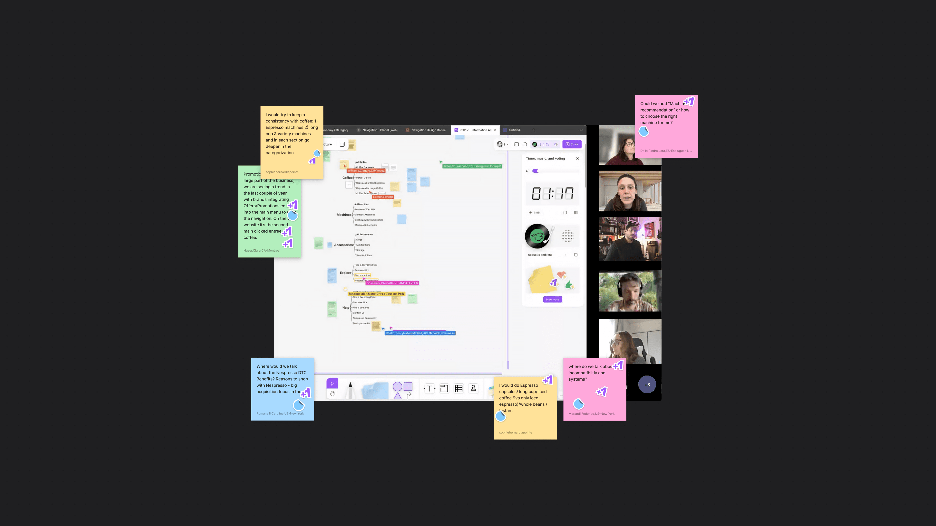
Stakeholder workshops

Signal 01

Described from the inside as overly cluttered and fiddly, worse on mobile.

Prior usability tests

Signal 02

Unclear structure, order and subscription details hard to locate, search ineffective.

Mobile analytics

Signal 03

Almost all interaction on three categories. Three real destinations and a long tail nobody touched.

Market requests

Signal 04

40+ markets each wanting their own arrangement. Every local fix made the global system less coherent.
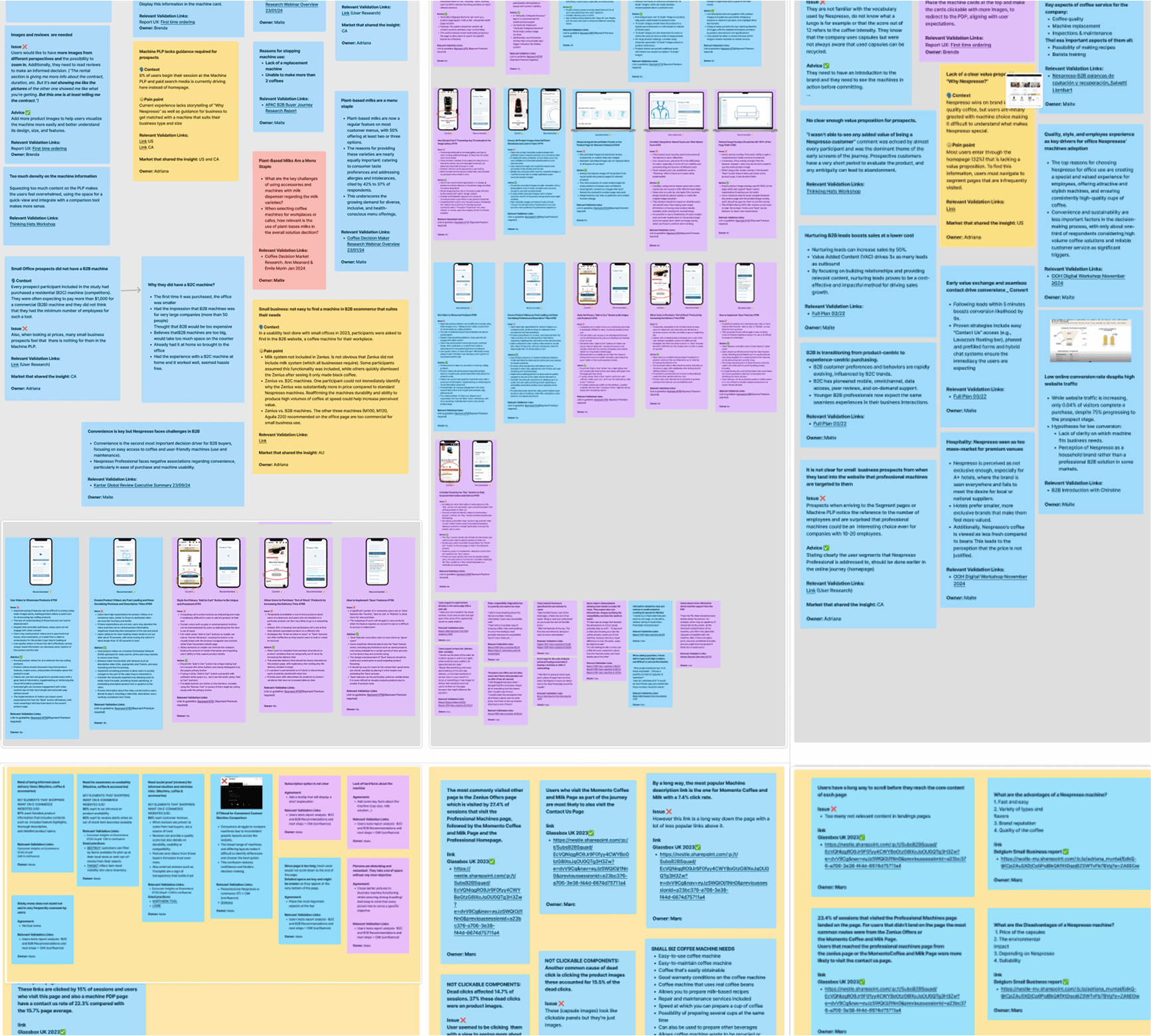
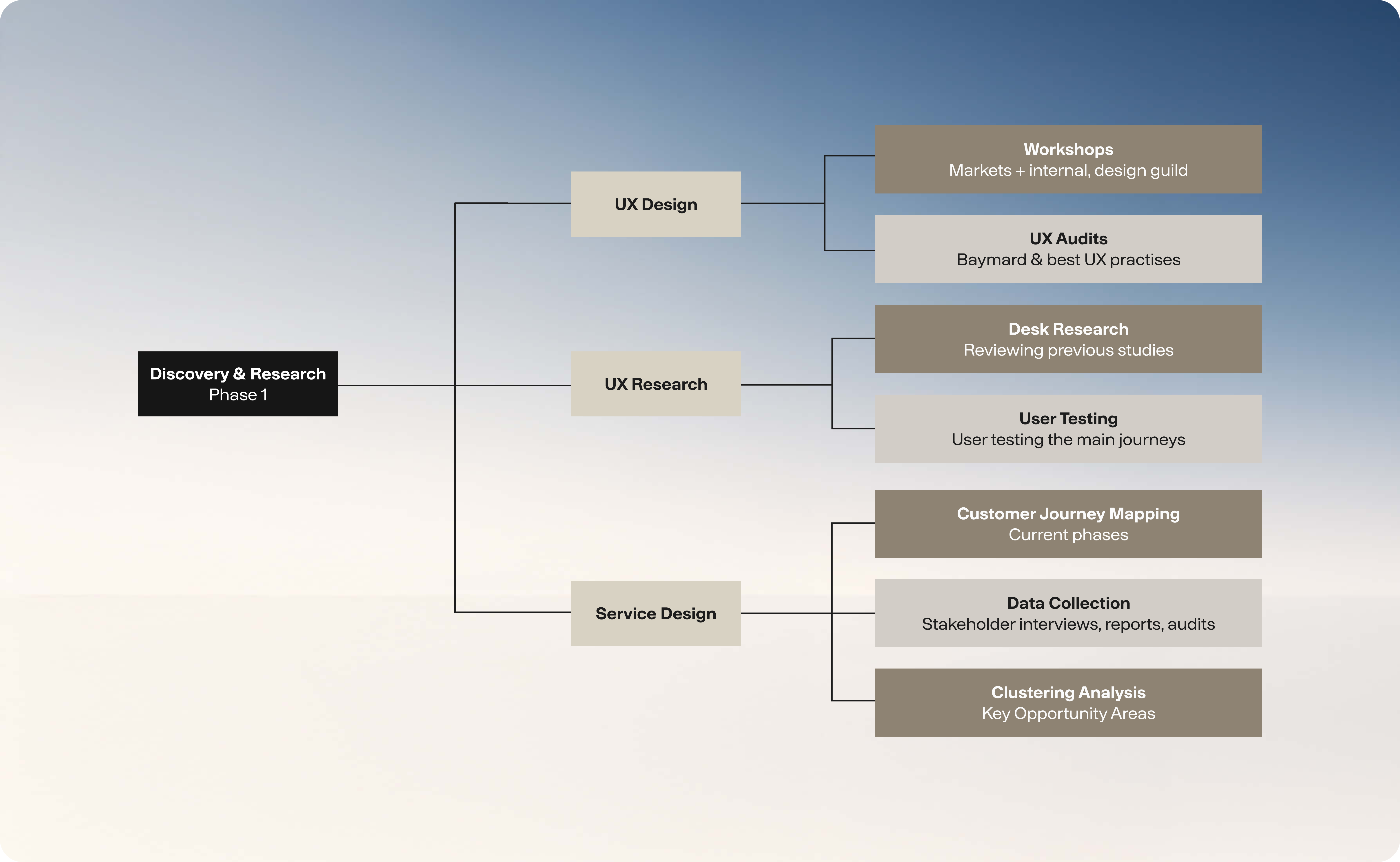
  • Discovery & Research phase: Included research studies, UX audits, stakeholder interviews, reports (CRC, CMI, RFA) and workshops.

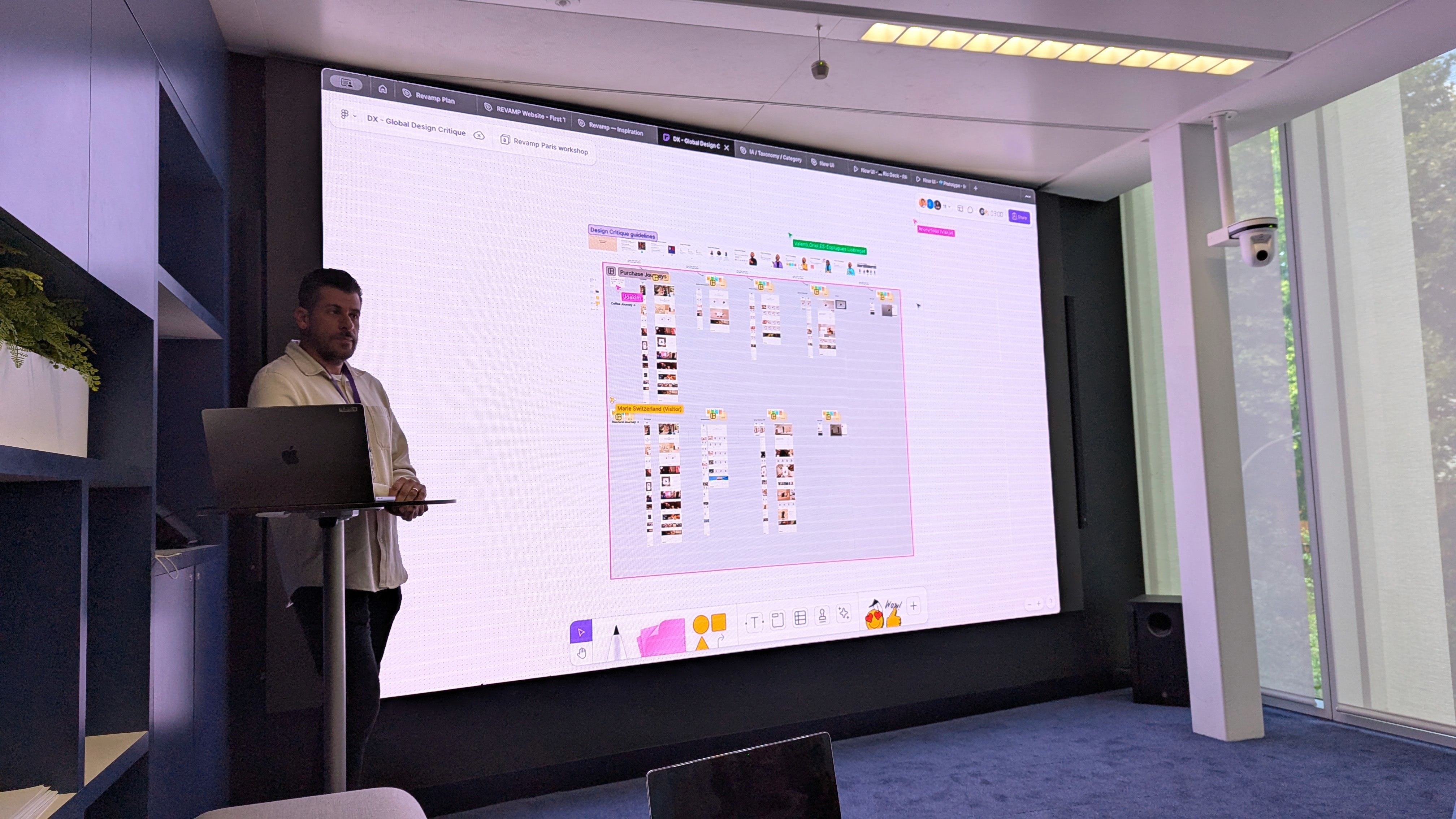
  • Paris workshop: Shared the long-term vision, gathered market insights, and jointly defined priorities for the next phase of delivery.

  • Navigation exercise: Working with markets on their preferred version, based on business needs, priorities and consumer behaviour.

  • Working sessions with the markets: Improved transparency while capturing key concerns and ideas.

  • Working session with the markets: Reviewed different navigation approaches, discussing patterns, labelling, and structural elements.

What markets raised

Cluttered and fiddly to use, especially on mobile

Too many items, and no clear path through them

Customers land on the wrong page for their machine

Filters are cumbersome and hard to use

Jargon descriptions; Vertuo versus Original unclear

What they asked for

Simplify it, particularly on mobile

Fewer top-level items, one clear path through

Get people to the right coffee for their machine

Filters that are quicker to use

Plain language instead of system names

How might we:

Create a navigation model customers can understand, while supporting different products, propositions and commercial needs across more than 40 markets?

DISCOVERY
DESIGN
DELIVERY

Research
Analytics &

existing studies

Workshops

Stakeholders &

market input

Card sorting
22 destinations

Tree testing

Three candidate

structures

Benchmarking

Seven brands

reviewed

Paris workshop

Nav co-creation
exercise

Prototyping

testing

20 participants,

7 countries

Governance

Implementation

guidelines

Strategy

Designing around customer intent, not the org chart.

Three inputs fed every decision. A structure satisfying only one wouldn’t survive the other two.

Business goals

Which categories, formats and partners we needed to grow.

Market variability

Different products, different habits, in every market.

User behaviour

How people search, browse and expect things to be filed.

DISCOVERY

DESIGN

DELIVERY

Research – Analytics & existing studies

Workshops – Stakeholders & market input

Card sorting – 22 destinations

Tree testing – Three candidate structures

Benchmarking – Seven brands reviewed

Paris workshop – Nav co-creation exercise

Prototyping testing – 20 participants, 7 countries

Governance – Implementation guidelines

DISCOVERY
DESIGN
DELIVERY

Research – Analytics & existing studies

Research
Analytics & existing studies

Workshops – Stakeholders & market input

Workshops

Stakeholders & market input

Card sorting – 22 destinations

Card sorting
22 destinations

Tree testing – Three candidate structures

Tree testing

Three candidate structures

Benchmarking – Seven brands reviewed

Benchmarking

Seven brands reviewed

Paris workshop – Nav co-creation exercise

Paris workshop

Nav co-creation exercise

Prototyping testing – 20 participants, 7 countries

Prototyping testing

20 participants, 7 countries

Governance – Implementation guidelines

Governance

Implementation guidelines

Business goal

Create an experience and navigation strategy that supports a broader coffee lifestyle.

Design goal

A more intuitive navigation.

Making navigation smooth yet scalable, and product discovery and comparison more efficient — so people find the product that best fits their needs.

From: Linear funnel

Home → category → product → cart. Efficient, transactional, few detours.

To: Ecosystem

Several ways in: formats, rituals, editorial, partner brands.

Sep 2023 ES market mobile data showed ~95% engaged with Coffee, Machines or Accessories, while low Vertuo engagement suggested limited awareness.

Card sorting revealed how users naturally group content, shaping the taxonomy. Tree testing then validated the structure by measuring findability, navigation paths, success rates and completion time.

Research

How customers actually think

Mobile analytics: almost all navigation interaction concentrated on core shopping categories, while technology-specific destinations barely registered.

Proposed navigation taxonomy: Developed from card-sorting insights and validated through tree testing.
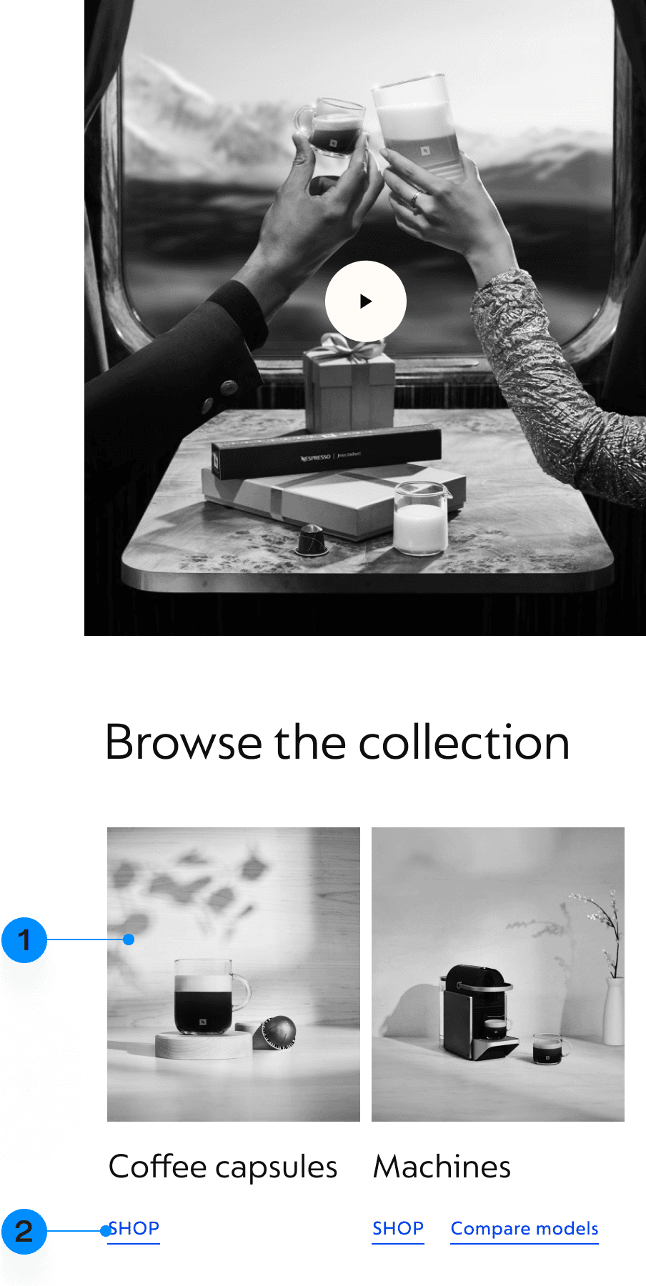
Homepage

1

Simplified system choice

We removed system complexity from the Homepage, helping users quickly start their purchase journey and move into the relevant PLP.

2

Introducing compatibility at the right moment

A single “Shop all” entry takes users to an intermediary PLP, where they first choose the coffee or machine system they’re shopping for.

Intermediary page

3

Guided choice before products

Users can explore all coffee types and choose what suits them before entering the product listing.

4

Built to scale

A scalable category structure supports future products without adding complexity or overloaded PLP filters.

5

Simplifying system comparison

The banner helps users understand the differences between systems through a simple side-by-side comparison.

PLP

6

Dedicated system PLP

Each PLP shows one coffee system only, with an easy route back to explore other types.

7

Clear filter visibility

The filter bar shows the number of products available and clearly indicates when filters are applied.

8

Mug size at a glance

Adding ml sizes to Vertuo capsules helps users quickly identify the right coffee size before using filters.

PDP

9

Clear compatibility on PDPs

A prominent compatibility message on Coffee and Machine PDPs removes system confusion, with a drawer explaining compatible machines or capsules.

10

Cup sizes at a glance

Cup sizes stay prominent on the PDP, helping users quickly see how many sizes each coffee can brew.

Comparison

11

Side-by-side comparison

The comparison panel helps users compare products and confidently choose the right one.

12

Guiding the next step

User testing validated quick links to compatible coffees or similar machines, helping users continue their journey.

Selected examples

Reflections

What I Learned

Leading work at this scale taught me that the biggest challenges aren’t always design problems. Building alignment across teams, adapting to different market needs, and driving change together are just as important as creating great user experiences.

What I'd Do Differently

Looking back, I’d spend more time working with local markets and keeping everyone better in the loop. I’d also promise myself fewer hands-on deliverables, giving me more time to review the team’s work, plan ahead, and support others. And I’d definitely push back on a few deadlines to avoid rushed decisions and shortcuts that you end up regretting later.

Selected Works – Soon

Navigation

Details Page

B&Q Search

Refined PDP

Tesco VR

Selected Works – Soon

More case studies are currently being prepared and will be added soon, featuring recent projects, real-world challenges, and the thinking behind the final outcomes. I’m taking the time to document them properly rather than rushing them out.

In the meantime, feel free to get in touch. I’m always happy to discuss other projects I’ve worked on, share additional examples, or walk you through work that isn’t yet available on the portfolio.

Navigation

Details Page

B&Q Search

Refined PDP

Tesco VR

Defined Nespresso’s global navigation strategy, creating a scalable information architecture that balanced global consistency with local market needs.

Coming soon