Client

Nestlé Nespresso

Project Type

Digital Transformation

Role

Global Product Design Lead

Team

Product, Design, Engineering, UXR, Content, Accessibility

Timeline

Oct 2024 - Present

Helping customers buy coffee that actually works with their machine.

Overview

During Nespresso’s global Revamp programme, we uncovered one of the biggest sources of customer friction in the coffee journey: compatibility between Original and Vertuo. The two systems share the same brand, website and shopping journey, but their capsules are not interchangeable. Customers were often expected to understand Nespresso’s internal terminology before they could confidently buy coffee.

What started as a redesign opportunity became something more important:
How might we help every customer confidently buy coffee they can actually use?

During Nespresso’s global Revamp programme, we uncovered one of the biggest sources of customer friction in the coffee journey: compatibility between Original and Vertuo. The two systems share the same brand, website and shopping journey, but their capsules are not interchangeable. Customers were often expected to understand Nespresso’s internal terminology before they could confidently buy coffee.

What started as a redesign opportunity became something more important:
How might we help every customer confidently buy coffee they can actually use?

Scope

Coffee and Machine discovery, PLP, PDP, filters and basket across 40+ markets.

My role

I led the design team while staying hands-on across problem framing, research, UX/UI design, prototyping and testing, working closely with Product, Engineering and key stakeholders.

Impact at a glance

0+

Markets aligned

Markets aligned aligned

0

Data signals

0

Global approach

0

Journey impact

0+

Markets aligned aligned

0

Design directions tested

0

Data sources joined up

0

New DS components

0

Template

0+

Markets aligned aligned

0

Design directions tested

0

Data sources joined up

0

New DS components

0

Reframes

Impact at a glance

0+

Markets aligned

0

Data signals

0

Global approach

0

Journey impact

0+

Markets aligned aligned

0

Design directions tested

0

Data sources joined up

0

New DS components

0

Template

0+

Markets aligned aligned

0

Design directions tested

0

Data sources joined up

0

New DS components

0

Reframes

Compatibility hidden

No compatible recommendations

No compatible machine guidance

Systems unclear

Brew size adds more ambiguity

Product relationships unclear

Context

Two systems. One brand. Zero compatibility.

Nespresso sells coffee across two incompatible systems. Different capsules, different extraction, zero cross-compatibility. The customer is never told which system they’re buying for.

Both systems sell a 40 ml drink. Both call it an Espresso. The capsules will not physically work in each other's machines. Several machine families exist on both sides (e.g. Creatista, Lattissima), so "I've got a Lattissima" tells nothing about what that customer can actually buy.

The customer was often being asked to understand the architecture of our business before they could make a simple purchase.

Original

Creatista Plus · Lattissima One · Gran Lattissima

Open capsule market. Third-party pods widely available.

Vertuo

Vertuo Creatista · Vertuo Lattissima

Barcode-read extraction. Closed capsule ecosystem.

The Collision

Same sub-brand names. Opposite systems. The name a customer knows is the one piece of information that can't resolve their question.

Carousel image
Slide 1 of 2
Carousel image
Slide 1 of 2
Carousel image
Slide 1 of 2

Context

Original

3 sizes

A capsule system focused primarily on espresso and smaller coffee formats.

25 ml · Ristretto

40 ml · Espresso

110 ml · Lungo

Same word
No fit

Vertuo

6 sizes

A separate system supporting a wider range of coffee sizes.

40 ml · Espresso

80 ml · Double

150 ml · Gran lungo

230 ml · Mug

355 ml · XL

535 ml · Carafe

What was the challenge?

A problem nobody owned

Four teams, four signals

Contact centre data, returns, PDP behaviour, and market jargon all pointed to compatibility. No one had joined them up because it was not anyone’s remit.

🌍

Contact centre

Confusion had a cost line

Balancing the needs of 42+ markets, each with different priorities, customer behaviours, and local requirements, while creating a consistent global experience.

🤝

Returns

The first order failed most

Bringing together Design, Product, Engineering, Content, UX Research, Accessibility, SEO, and local markets around one direction.

🧩

PDP behaviour

Silently in the wrong half

Incremental changes had created fragmented journeys and inconsistent patterns that no longer reflected how customers shop.

📈

Market jargon

Local fixes, global cause

Supporting subscriptions, promotions, storytelling, and commercial goals without disrupting an active global business.

What was the challenge?

What was the challenge?

Four datasets. One underlying problem.

Compatibility had never been anyone's remit, so nobody had joined the signals up. In discovery we did.

Why this mattered

Markets had been layering their own terminology on top of the confusion for years. Everyone was solving the symptom locally. Nobody owned the cause.

Contact centre

Signal 01

Enquiry volume tagged to compatibility. Confusion already had a very real cost line, it just sat in someone else's budget.

Returns

Signal 02

Return rate on first coffee orders. The purchase that should build customer confidence and habit was the one most likely to fail.

PDP behaviour

Signal 03

Drop-off where customers entered a product page from the wrong system. Arriving in the wrong half of the catalogue, silently.

New machine owners

Signal 04

Percentage of customers whose first coffee order was for a system they didn’t own. The clearest sign the experience was failing.

The reframe

The brief said revamp. The evidence said something else.

Compatibility should be treated as a customer problem to solve across the whole journey, not simply a product constraint to explain.

That wasn't in the brief. It changed what we designed, what we tested, and eventually what 40+ markets agreed to ship.

The brief

Revamp the coffee shopping experience.

What discovery showed

Customers weren't confident which coffee worked with their machine.

The reframe I argued for

How might we help every customer confidently buy coffee they can actually use?

Carousel image
Slide 1 of 3

1.
Research & Insights

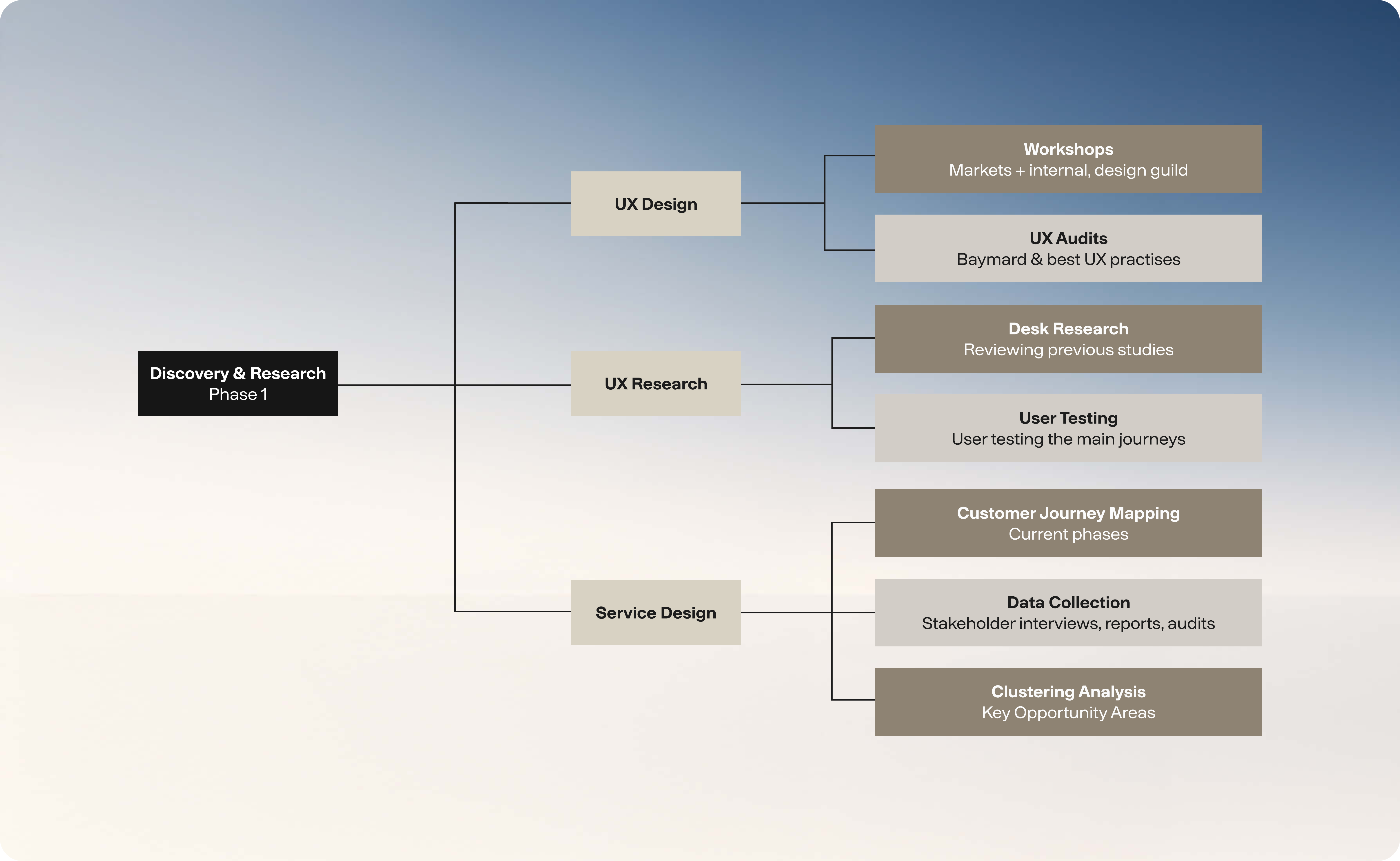
We started by bringing together insights from customers, markets, analytics, and stakeholder workshops. Looking at the problem from different angles helped us build a clearer picture of where the experience was falling short.

Common themes quickly emerged around discovery, content, consistency, and scalability. These insights helped align teams around the biggest opportunities and informed many of the decisions that followed.

Methodologies

Discovery & Research

The discovery phase brought together user research, analytics, stakeholder workshops, usability testing, and Baymard best practices to identify key pain points and guide design decisions.

👥

Usability testing (Customers & Prospects)

Usability testing with both existing customers and prospects validated key decisions, uncovered friction points, and refined the experience before development.

🔍

Quantitative and CRC Data

Quantitative data from CRC, CMI, and analytics identified behavioural patterns, validated assumptions, and helped prioritise opportunities for improvement.

🌍

Teams & markets pain-points

Workshops with markets, squads, and cross-functional teams uncovered pain points, aligned priorities, and informed key product and experience decisions.

2.
Strategic Decisions

Hard separation made the system the hero. In-card badges arrived too late. Progressive guidance across PLP, PDP, and basket met doubt where it starts.

Carousel image
Slide 1 of 4
Carousel image
Slide 1 of 4

3.
Building the Platform

Instead of creating one-off page designs, we focused on building a platform that could scale. Shared templates, reusable patterns, and Design System foundations helped create consistency across the experience.

We also introduced governance and clear implementation guidelines, giving markets the flexibility they needed without losing sight of the bigger picture.

4.
Designing for Scale

Scalability influenced almost every decision we made. The goal wasn't just to redesign a website, but to create a composable ecosystem capable of supporting more than 40 markets while balancing global consistency with local flexibility.

Carousel image
Slide 1 of 4

Strategy

Exploration

Homepage

  1. 1. The reframe

1

Simplified system choice

We removed system complexity from the Homepage, helping users quickly start their purchase journey and move into the relevant PLP.

2

Introducing compatibility at the right moment

A single “Shop all” entry takes users to an intermediary PLP, where they first choose the coffee or machine system they’re shopping for.

Intermediary page

  1. 1. The reframe

3

Guided choice before products

Users can explore all coffee types and choose what suits them before entering the product listing.

4

Built to scale

A scalable category structure supports future products without adding complexity or overloaded PLP filters.

5

Simplifying system comparison

The banner helps users understand the differences between systems through a simple side-by-side comparison.

PLP

  1. 1. The reframe

6

Dedicated system PLP

Each PLP shows one coffee system only, with an easy route back to explore other types.

7

Clear filter visibility

The filter bar shows the number of products available and clearly indicates when filters are applied.

8

Mug size at a glance

Adding ml sizes to Vertuo capsules helps users quickly identify the right coffee size before using filters.

PDP

  1. 1. The reframe

9

Guided choice before products

Users can explore all coffee types and choose what suits them before entering the product listing.

10

Clear compatibility on PDPs

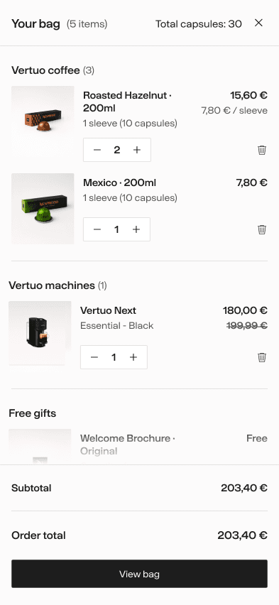
A prominent compatibility message on Coffee and Machine PDPs removes system confusion, with a drawer explaining compatible machines or capsules.

Comparison

  1. 1. The reframe

11

Side-by-side comparison

The comparison panel helps users compare products and confidently choose the right one.

12

Guiding the next step

User testing validated quick links to compatible coffees or similar machines, helping users continue their journey.

Ideas That Didn’t Make the Cut

Other ideas didn’t make the cut, including a mini-basket compatibility alert due to tech constraints, while ‘Notify Me’ and ‘Recipes’ were out of scope.

Visual Direction

Homepage (modular approach)

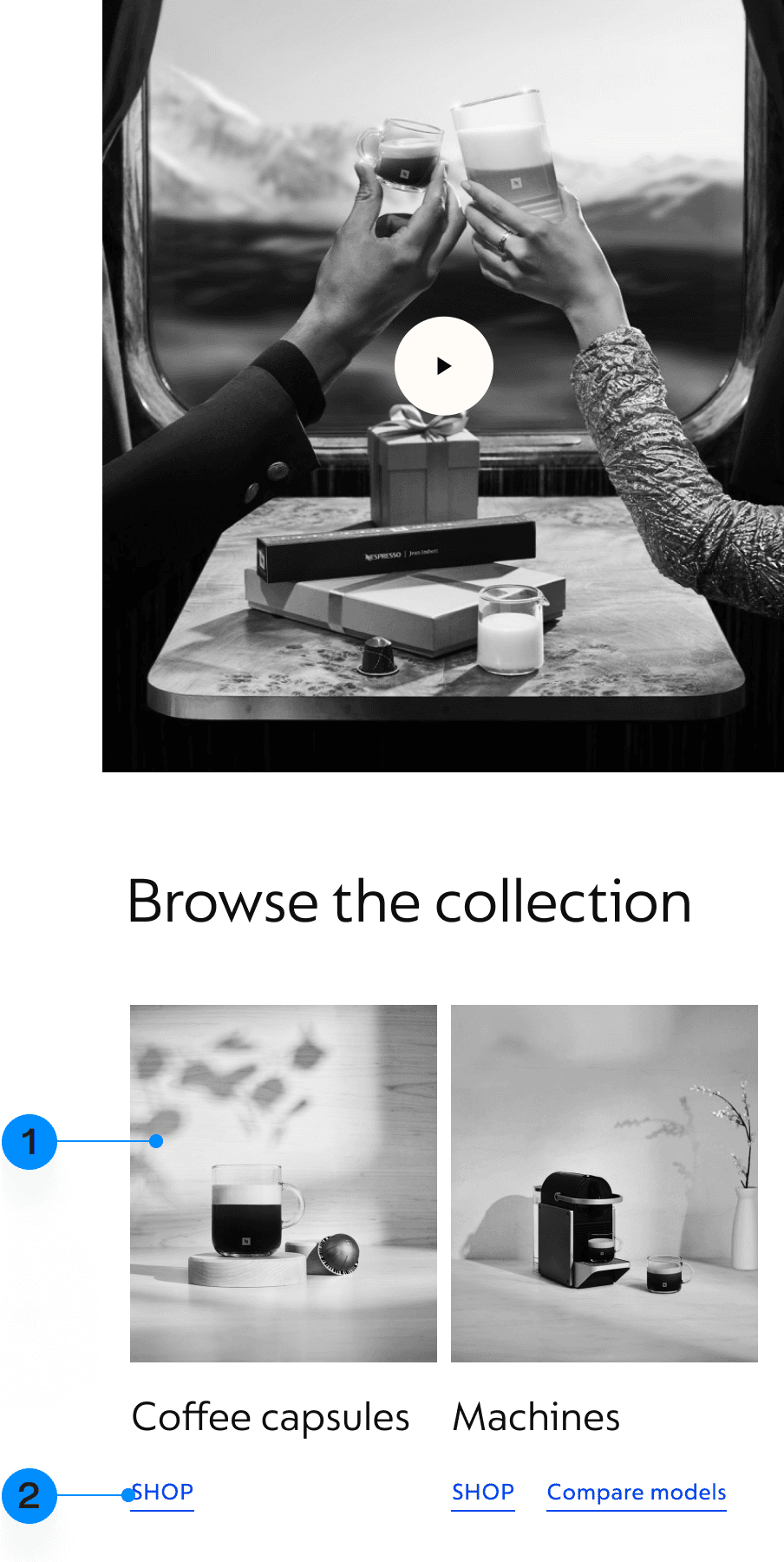
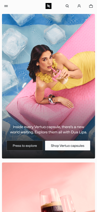
The Homepage combines fixed and flexible blocks, allowing markets to adapt content to local needs. Clear governance ensured consistency while supporting different block combinations, priorities, and storytelling approaches.

Selected examples

A problem nobody owned

Four teams, four signals

Contact centre data, returns, PDP behaviour, and market jargon all pointed to compatibility. No one had joined them up because it was not anyone’s remit.

🌍

Contact centre

Confusion had a cost line

Balancing the needs of 42+ markets, each with different priorities, customer behaviours, and local requirements, while creating a consistent global experience.

🤝

Returns

The first order failed most

Bringing together Design, Product, Engineering, Content, UX Research, Accessibility, SEO, and local markets around one direction.

🧩

PDP behaviour

Silently in the wrong half

Incremental changes had created fragmented journeys and inconsistent patterns that no longer reflected how customers shop.

📈

Market jargon

Local fixes, global cause

Supporting subscriptions, promotions, storytelling, and commercial goals without disrupting an active global business.

Visual Direction

Homepage (modular approach)

The Homepage combines fixed and flexible blocks, allowing markets to adapt content to local needs. Clear governance ensured consistency while supporting different block combinations, priorities, and storytelling approaches.

Selected examples

Selected examples

Animations

Animations and micro-interactions were thoughtfully crafted and documented across all blocks and components, reinforcing Nespresso’s premium brand while ensuring consistency and scalability across markets.

Animations

Animations and micro-interactions were thoughtfully crafted and documented across all blocks and components, reinforcing Nespresso’s premium brand while ensuring consistency and scalability across markets.

Animations

Animations and micro-interactions were thoughtfully crafted and documented across all blocks and components, reinforcing Nespresso’s premium brand while ensuring consistency and scalability across markets.

Reflections

What I Learned

Leading work at this scale taught me that the biggest challenges aren’t always design problems. Building alignment across teams, adapting to different market needs, and driving change together are just as important as creating great user experiences.

What I'd Do Differently

Looking back, I’d spend more time working with local markets and keeping everyone better in the loop. I’d also promise myself fewer hands-on deliverables, giving me more time to review the team’s work, plan ahead, and support others. And I’d definitely push back on a few deadlines to avoid rushed decisions and shortcuts that you end up regretting later.

Selected Works – Soon

Selected Works – Soon

More case studies are currently being prepared and will be added soon, featuring recent projects, real-world challenges, and the thinking behind the final outcomes. I’m taking the time to document them properly rather than rushing them out.

In the meantime, feel free to get in touch. I’m always happy to discuss other projects I’ve worked on, share additional examples, or walk you through work that isn’t yet available on the portfolio.

Navigation

Navigation

Details Page

Details Page

B&Q Search

B&Q Search

Refined PDP

Refined PDP

Tesco VR

Tesco VR

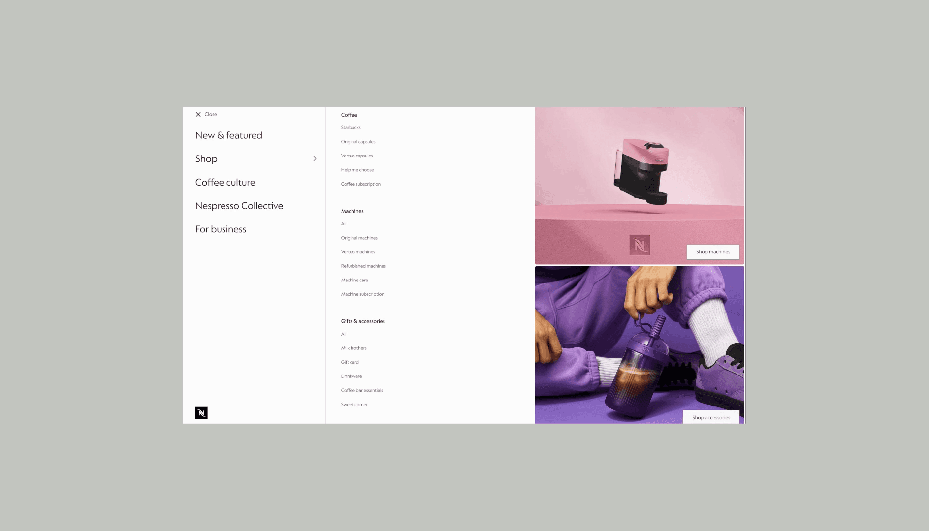
Defined Nespresso’s global navigation strategy, creating a scalable information architecture that balanced global consistency with local market needs.

Coming soon

Client

Nestlé Nespresso

Project Type

Digital Transformation

Role

Global Product Design Lead

Team

Product, Design, Engineering, UXR, Content, Accessibility, SEO

Timeline

Oct 2024 - Present

Helping customers buy coffee that actually works with their machine.

Scope

Coffee PLP, PDP, filters and basket across 40+ markets. I designed system components and blocks so the solution could scale across surfaces we had not yet seen.

Overview

Nespresso sells across two incompatible systems, Original and Vertuo. During Revamp discovery, compatibility emerged as a major source of customer friction — and one nobody owned.

My role

I led the design team and worked hands-on: framing the problem, prototyping directions, running testing, and bringing sceptical markets with us.